一、区域图
2D
面积图与线图相似,加上绘制线下方的面积。不同的变种可通过设置分组到“标准”,“叠”或“percentstacked”;“标准”是默认的。
from openpyxl import Workbookfrom openpyxl.chart import (
    AreaChart,
    Reference,
    Series,)wb = Workbook()ws = wb.activerows = [
    ['Number', 'Batch 1', 'Batch 2'],
    [2, 40, 30],
    [3, 40, 25],
    [4, 50, 30],
    [5, 30, 10],
    [6, 25, 5],
    [7, 50, 10],]for row in rows:
    ws.append(row)chart = AreaChart()chart.title = "Area Chart"chart.style = 13chart.x_axis.title = 'Test'chart.y_axis.title = 'Percentage'cats = Reference(ws, min_col=1, min_row=1, max_row=7)data = Reference(ws, min_col=2, min_row=1, max_col=3, max_row=7)chart.add_data(data, titles_from_data=True)chart.set_categories(cats)ws.add_chart(chart, "A10")wb.save("area.xlsx")

3D
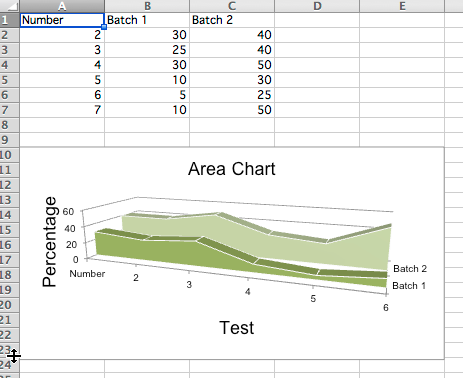
您还可以创建三维区域图
from openpyxl import Workbookfrom openpyxl.chart import (
    AreaChart3D,
    Reference,
    Series,)wb = Workbook()ws = wb.activerows = [
    ['Number', 'Batch 1', 'Batch 2'],
    [2, 30, 40],
    [3, 25, 40],
    [4 ,30, 50],
    [5 ,10, 30],
    [6,  5, 25],
    [7 ,10, 50],]for row in rows:
    ws.append(row)chart = AreaChart3D()chart.title = "Area Chart"chart.style = 13chart.x_axis.title = 'Test'chart.y_axis.title = 'Percentage'chart.legend = Nonecats = Reference(ws, min_col=1, min_row=1, max_row=7)data = Reference(ws, min_col=2, min_row=1, max_col=3, max_row=7)chart.add_data(data, titles_from_data=True)chart.set_categories(cats)ws.add_chart(chart, "A10")wb.save("area3D.xlsx")
This produces a simple 3D area chart where third axis can be used to replace the legend:
二、柱状图
他以下设置会影响不同的图表类型。
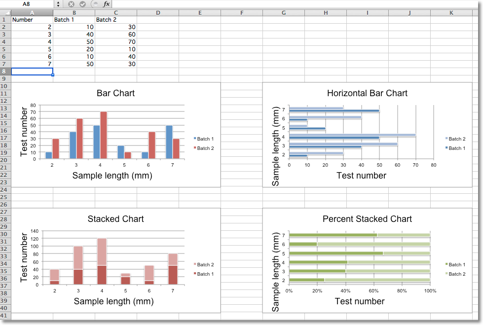
通过将类型分别设置为col或bar来切换垂直和水平条形图。
当使用堆叠图表时,重叠需要设置为100。
如果条形是水平的,则x和y轴被折叠。
from openpyxl import Workbook
from openpyxl.chart import BarChart, Series, Reference
wb = Workbook(write_only=True)
ws = wb.create_sheet()
rows = [
('Number', 'Batch 1', 'Batch 2'),
(2, 10, 30),
(3, 40, 60),
(4, 50, 70),
(5, 20, 10),
(6, 10, 40),
(7, 50, 30),
]
for row in rows:
ws.append(row)
chart1 = BarChart()
chart1.type = "col"
chart1.style = 10
chart1.title = "Bar Chart"
chart1.y_axis.title = 'Test number'
chart1.x_axis.title = 'Sample length (mm)'
data = Reference(ws, min_col=2, min_row=1, max_row=7, max_col=3)
cats = Reference(ws, min_col=1, min_row=2, max_row=7)
chart1.add_data(data, titles_from_data=True)
chart1.set_categories(cats)
chart1.shape = 4
ws.add_chart(chart1, "A10")
from copy import deepcopy
chart2 = deepcopy(chart1)
chart2.style = 11
chart2.type = "bar"
chart2.title = "Horizontal Bar Chart"
ws.add_chart(chart2, "G10")
chart3 = deepcopy(chart1)
chart3.type = "col"
chart3.style = 12
chart3.grouping = "stacked"
chart3.overlap = 100
chart3.title = 'Stacked Chart'
ws.add_chart(chart3, "A27")
chart4 = deepcopy(chart1)
chart4.type = "bar"
chart4.style = 13
chart4.grouping = "percentStacked"
chart4.overlap = 100
chart4.title = 'Percent Stacked Chart'
ws.add_chart(chart4, "G27")
wb.save("bar.xlsx")
这将产生四个图表,说明各种可能性。
3D条形图
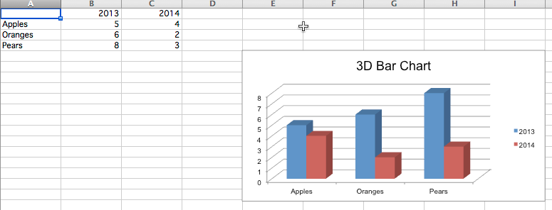
您还可以创建三维条形图。
from openpyxl import Workbookfrom openpyxl.chart import (
Reference,
Series,
BarChart3D,)
wb = Workbook()ws = wb.active
rows = [
(None, 2013, 2014),
("Apples", 5, 4),
("Oranges", 6, 2),
("Pears", 8, 3)]
for row in rows:
ws.append(row)
data = Reference(ws, min_col=2, min_row=1, max_col=3, max_row=4)
titles = Reference(ws, min_col=1, min_row=2, max_row=4)
chart = BarChart3D()
chart.title = "3D Bar Chart"
chart.add_data(data=data, titles_from_data=True)
chart.set_categories(titles)
ws.add_chart(chart, "E5")
wb.save("bar3d.xlsx")
这会生成一个简单的3D条形图。
气泡图
气泡图类似于散点图,但使用第三维来确定气泡的大小。图表可以包括多个系列。
from openpyxl import Workbook
from openpyxl.chart import Series, Reference, BubbleChart
wb = Workbook()
ws = wb.active
rows = [
("Number of Products", "Sales in USD", "Market share"),
(14, 12200, 15),
(20, 60000, 33),
(18, 24400, 10),
(22, 32000, 42),
(),
(12, 8200, 18),
(15, 50000, 30),
(19, 22400, 15),
(25, 25000, 50),
]
for row in rows:
ws.append(row)
chart = BubbleChart()
chart.style = 18 # use a preset style
# add the first series of data
xvalues = Reference(ws, min_col=1, min_row=2, max_row=5)
yvalues = Reference(ws, min_col=2, min_row=2, max_row=5)
size = Reference(ws, min_col=3, min_row=2, max_row=5)
series = Series(values=yvalues, xvalues=xvalues, zvalues=size, title="2013")
chart.series.append(series)
# add the second
xvalues = Reference(ws, min_col=1, min_row=7, max_row=10)
yvalues = Reference(ws, min_col=2, min_row=7, max_row=10)
size = Reference(ws, min_col=3, min_row=7, max_row=10)
series = Series(values=yvalues, xvalues=xvalues, zvalues=size, title="2014")
chart.series.append(series)
# place the chart starting in cell E1
ws.add_chart(chart, "E1")
wb.save("bubble.xlsx")
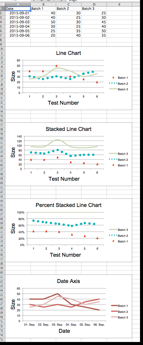
三、线图
折线图允许相对于固定轴绘制数据。 它们与散点图类似,主要区别在于使用折线图,每个数据系列都绘制相同的值。 辅助轴可以使用不同种类的轴。
与条形图类似,有三种折线图:标准,堆叠和百分比重叠。
from datetime import date
from openpyxl import Workbook
from openpyxl.chart import (
LineChart,
Reference,
)
from openpyxl.chart.axis import DateAxis
wb = Workbook()
ws = wb.active
rows = [
['Date', 'Batch 1', 'Batch 2', 'Batch 3'],
[date(2015,9, 1), 40, 30, 25],
[date(2015,9, 2), 40, 25, 30],
[date(2015,9, 3), 50, 30, 45],
[date(2015,9, 4), 30, 25, 40],
[date(2015,9, 5), 25, 35, 30],
[date(2015,9, 6), 20, 40, 35],
]
for row in rows:
ws.append(row)
c1 = LineChart()
c1.title = "Line Chart"
c1.style = 13
c1.y_axis.title = 'Size'
c1.x_axis.title = 'Test Number'
data = Reference(ws, min_col=2, min_row=1, max_col=4, max_row=7)
c1.add_data(data, titles_from_data=True)
# Style the lines
s1 = c1.series[0]
s1.marker.symbol = "triangle"
s1.marker.graphicalProperties.solidFill = "FF0000" # Marker filling
s1.marker.graphicalProperties.line.solidFill = "FF0000" # Marker outline
s1.graphicalProperties.line.noFill = True
s2 = c1.series[1]
s2.graphicalProperties.line.solidFill = "00AAAA"
s2.graphicalProperties.line.dashStyle = "sysDot"
s2.graphicalProperties.line.width = 100050 # width in EMUs
s2 = c1.series[2]
s2.smooth = True # Make the line smooth
ws.add_chart(c1, "A10")
from copy import deepcopy
stacked = deepcopy(c1)
stacked.grouping = "stacked"
stacked.title = "Stacked Line Chart"
ws.add_chart(stacked, "A27")
percent_stacked = deepcopy(c1)
percent_stacked.grouping = "percentStacked"
percent_stacked.title = "Percent Stacked Line Chart"
ws.add_chart(percent_stacked, "A44")
# Chart with date axis
c2 = LineChart()
c2.title = "Date Axis"
c2.style = 12
c2.y_axis.title = "Size"
c2.y_axis.crossAx = 500
c2.x_axis = DateAxis(crossAx=100)
c2.x_axis.number_format = 'd-mmm'
c2.x_axis.majorTimeUnit = "days"
c2.x_axis.title = "Date"
c2.add_data(data, titles_from_data=True)
dates = Reference(ws, min_col=1, min_row=2, max_row=7)
c2.set_categories(dates)
ws.add_chart(c2, "A61")
wb.save("line.xlsx")
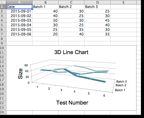
3D线图
在3D线图中,第三轴与该系列的图例相同。
from datetime import date
from openpyxl import Workbook
from openpyxl.chart import (
LineChart3D,
Reference,
)
from openpyxl.chart.axis import DateAxis
wb = Workbook()
ws = wb.active
rows = [
['Date', 'Batch 1', 'Batch 2', 'Batch 3'],
[date(2015,9, 1), 40, 30, 25],
[date(2015,9, 2), 40, 25, 30],
[date(2015,9, 3), 50, 30, 45],
[date(2015,9, 4), 30, 25, 40],
[date(2015,9, 5), 25, 35, 30],
[date(2015,9, 6), 20, 40, 35],
]
for row in rows:
ws.append(row)
c1 = LineChart3D()
c1.title = "3D Line Chart"
c1.legend = None
c1.style = 15
c1.y_axis.title = 'Size'
c1.x_axis.title = 'Test Number'
data = Reference(ws, min_col=2, min_row=1, max_col=4, max_row=7)
c1.add_data(data, titles_from_data=True)
ws.add_chart(c1, "A10")
wb.save("line3D.xlsx")
剩下的略
http://openpyxl.readthedocs.io/en/default/charts/introduction.html

 微信扫一扫,打赏作者吧~